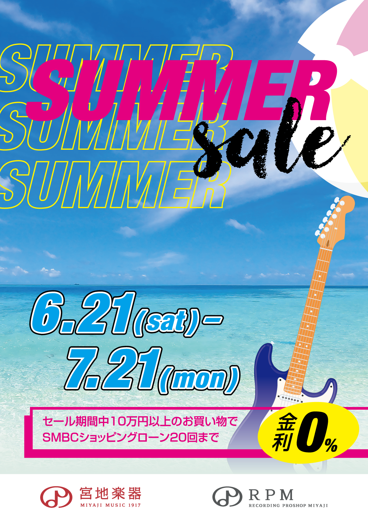
Utilising imagery that evokes a day on the beach, I created promotional material for a summer sale that was running at Miyaji Music.
Adobe Illustrator, June 2025
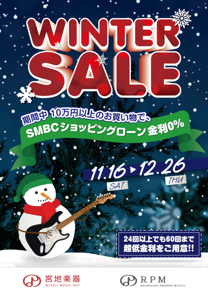
Winter Sale
I was tasked with creating a poster advertising for a winter sale at Miyaji Music and RPM (Recording Proshop Miyaji), a music shop and recording equipment specialist.
Using festive colours, I utilised various graphics and manipulated them to have the snowman holding the guitar.
Adobe Illustrator, November 2024
Student Discount Poster
This is a poster for a promotion targeted at current students and recent graduates.
I chose to theme the poster around cherry blossoms, a mark of spring, especially in Japan. The two students included in the design are in traditional Japanese uniform.
I paired the pink of the cherry blossoms with a bright, contrasting blue to give attention to the “introduce a friend” promotion, running concurrently.
Adobe Illustrator, March 2020
In-Store Guidance
This is a poster showcasing the various types of products available on the second floor of a recording equipment shop.
Some customers were confused on whether the shop was open when the door was closed. To clear confusion, I was tasked with creating a poster asking people to knock before entering.
Additionally, I included some minimalistic illustrations of various pieces of recording equipment – a monitor speaker, a condenser microphone and an outboard compressor.
Adobe Illustrator, November 2019
Floor Plan Illustration
In this project I made a floor plan for two floors, showing the various products available for sale from a bird’s eye view.
Initial drafts of this project started out far too “blocky”. As a result, I was asked to create it in a “hand drawn” style.
I took out each section and colour coded them to make it easy to see where things are from a glance. Additionally, I included illustrations of the various products available, such as earphones, speakers, microphones and audio interfaces.
Adobe Illustrator, January 2020
Flyers and Leaflets
Carrot juice leaflet
For this project, I created a leaflet for 100% pure carrot juice. I utilised a bold orange colour and large, eye-catching type.
Since this is a 100% pure juice, I wanted to emphasise this in the design. The front features the bottle slightly rotated to give it a playful feel, contrasted with the “luxury” feel of the photo in the bottom left.
Added later on in the design process, the farmer holding the carrot as seen at the bottom was placed to give the viewer a sense of trust – that the ingredients used to make the product are coming from a local farm and not a faceless corporation.
On the backside, I chose to concentrate on “奇跡 kiseki” (miracle), as I wanted to give attention to how fresh the juice was, and that it was something you wouldn’t find in the everyday supermarket.
Adobe InDesign, March 2020
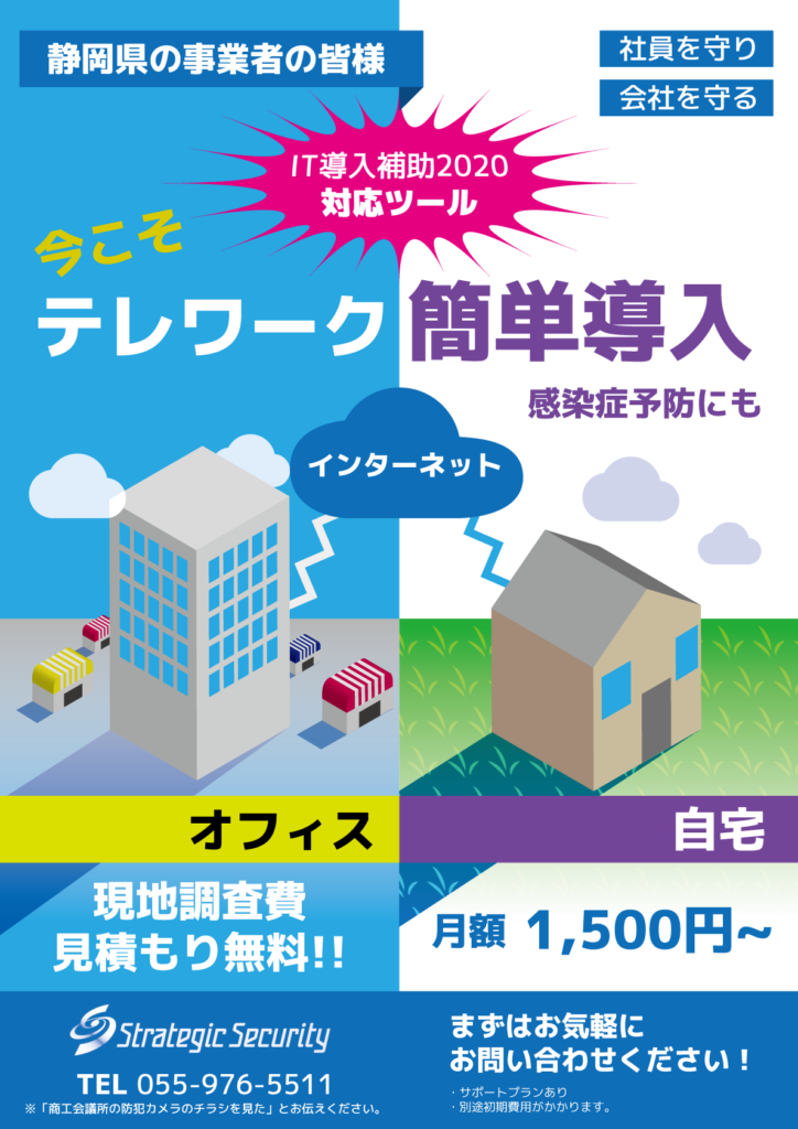
Remote Work Leaflet
I based this leaflet on the concept of whether you are at the office or at home, as long as you have an internet connection, carrying out work is easy.
For the office building on the left, I created a skyscraper surrounded by various smaller shops in a typical business district.
The house on the right is in a more natural setting.
Adobe Illustrator, April 2020
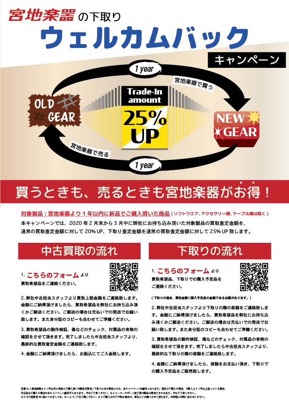
"Welcome Back" Promotional Flyer
For this flyer, I elaborated on the details of the campaign in a clear and concise way. The bottom half shows the method on how to either sell used goods or receive a discount on a newly bought product.
Originally, the bottom half of the poster was not included, however as there is so little text it was thought that a more thorough explanation of the campaign was required.
I made sure to point out what products are eligible for the deal, in addition to writing out the steps in a number format that is easy to follow.
Adobe InDesign, February 2020
Social Media Banners
Telecommuting
Essentials
With telecommuting becoming increasingly mainstream in recent times, this banner features various products such as audio mixers, microphones, desktop stands and more, perfect for live broadcasts on streaming platforms and video calls.
Adobe Photoshop, April 2020
Classic Gear Studio Add-On Option
A banner advertising a limited time promotion for a recording studio rental service. Featured in this banner is the Neumann U87Ai, a standard across recording studios the world around, in addition to an outboard compressor.
Adobe Photoshop, March 2020
Microphone
Bundle
Featuring the “Kaotica Eyeball”, a product that lets you easily improve your sound while recording at home, this is a banner advertising a special bundle pairing the Eyeball with MXL microphones.
Adobe Photoshop, April 2020
Other Print Media
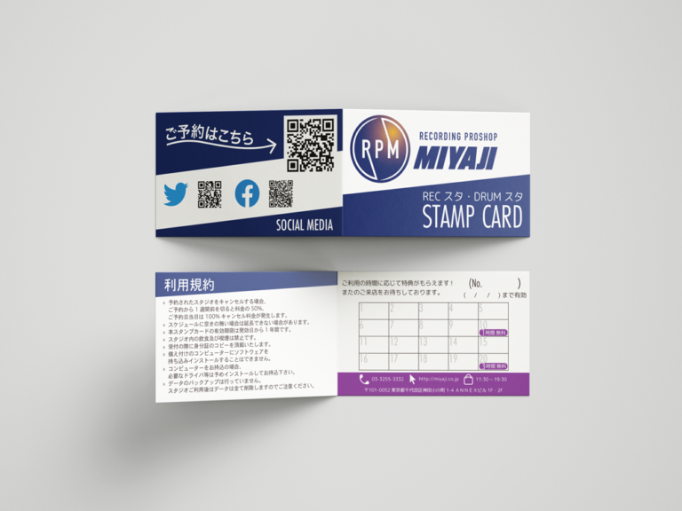
Stamp Card
This is a stamp card I made for a recording studio rental service.
Utilising the colours of the “RPM” logo, I created a stamp card that is bold and easy to recognise.
Adobe Illustrator, December 2019
workflow overview
I work using a combination of Photoshop and Illustrator. Additionally, I utilise InDesign for making informational leaflets and other materials for print.
PHOTOSHOP
ILLUSTRATOR
INDESIGN
MARKETING
I Also Do JP EN Translation
Specialising in music, recording equipment and Japanese popular culture, I can widen your market letting you reach out and expand your business.